| 1. | On the edit Interface window, click the Pop-out Content Buttons tab to configure buttons for pop-up content. Note: Up to five buttons can be configured (text only, icon only or icon and text). Buttons can be deleted by clicking the corresponding delete icon. |
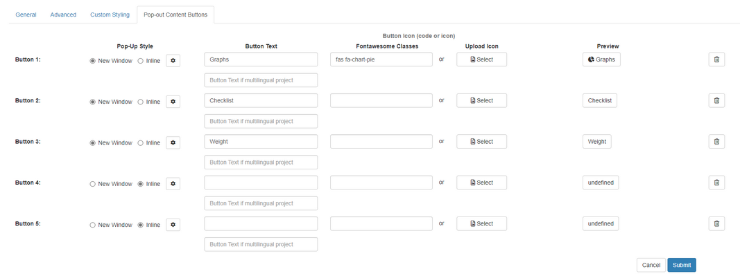
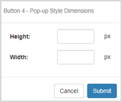
| 2. | To configure a button, select the Pop-up Style (New Window or Inline). Note: When Inline is selected, a Pop-up Style Dimensions window opens. |
| 3. | On the Pop-up Style Dimensions window, enter the desired dimensions and click the Submit button. |
| 4. | On the Pop-out Content Buttons tab, enter the desired button text in the Button Text field or leave it blank. Note: A maximum of 40 characters may be entered in the Button Text field. |
| 5. | Enter a Font Awesome class in the Fontawesome Classes field or click the Select button to upload a desired icon or leave blank. Note: Font Awesome classes can be sourced on the internet. Only free Font Awesome classes are supported. |
| 6. | Click the Submit button to save the changes or click the Cancel button to return to the previous screen without saving. |
|