Thumbnail
|
Description
|

|
3.10 Media with Highlights. Click Text Options or links to display up to nine corresponding highlighted areas on the media asset. Collapsible text areas may also be included beneath each Text Option, to be revealed when they are clicked (static images only - png, jpg, gif). Allows selection between these layouts: "100% Text, No Media", "40% Text, 60% Media", "50% Text, 50% Media", "60% Text, 40% Media", .
|
This screen style basically displays a list of bullet points with text on the left side of the viewer, which the user can click to highlight different areas on an image on the right side of the viewer. It is similar to 3.17 except that instead of multiple images, a single default image is displayed with multiple areas on it which can be highlighted.
| 1. | In addition to the standard fields, including Main Text, this screen has a Graphics tab that contains a single Default Graphic field, which functions in the same way as the Graphic fields in the basic graphic screen styles described earlier. However, the images will be displayed on the right side of the viewer with yellow boxes superimposed to highlight specific areas in response to user interaction. The Graphic tab is disabled when the "100% Text, No Media" option is chosen. |
| 2. | The Caption field holds HTML that will be displayed below the Default Graphic. Note: Hyperlinks and inline images may also be entered in the Caption field using the HTML editor. |
| 3. | This screen style also has a Text Options tab with multiple numbered fields, which is used to define the text displayed as interactive bullet points on the left side of the viewer. Click the Add Text Option button at the bottom of the tab to add more options, to a maximum of nine. HTML tags can be inserted into the Text Options field to format text. To re-order Text Options fields, use the drag handles on the top-left of the Text Option field. Note: If the Text Option has a plotted shape, the shape will also be reordered. To remove a text option, click the Remove Text Option icon. Note: If the Text Option has a plotted shape, the shape will also be deleted. |
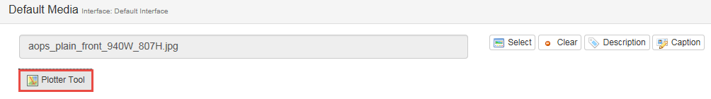
| 4. | Click the Plotter Tool button to open the Plotter Tool window. Note: One or more highlights can be plotted using this tool for each Text Option or Link in the Main Text or Collapsible text area. Note: See The Plotter Tool for more information. |
| 5. | Click the Collapsible Text button to display an HTML editor field for optional hidden text that will appear when the corresponding Text Option is clicked in the viewer. |
| 6. | Links to highlights on the image can be added to the Main Text area or to Collapsible text. When the user clicks a Link, the plot area defined by the corresponding Coordinates is highlighted on the image, in the style selected using the Plotter Tool. See Add/Edit/Delete Hyperlinks for more information on this feature. |
| 7. | Click the checkbox labeled Autoselect first option on load to display Text Option 1 with its corresponding Coordinate when the screen loads. |
| 8. | When you preview this screen style, the Default Graphic displays on the right with Main Text and Text Options on the left. When each Text Option is clicked, its associated highlight is automatically displayed on the image. Highlights appear in the order of the Text Options. For example, clicking Text Option 1 will bring up Coordinate 1. Clicking another text option will hide the first coordinate and show the one matching the currently selected text option. Coordinates associated with Links will be displayed according to the Hotspot manually selected from the list of available hotspots. See Hyperlink to Image Highlight (Hotspot) for more information on this feature. |
|