Thumbnail
|
Description
|
|
3.11 Media with Hotspots. Click Text Options or corresponding highlighted hotspots on the media asset to reveal an additional media asset, which must be a static graphic, either in a pop-up window or replacing the main media asset. This screen style can be used to create simple interactive control panels. Collapsible text areas may also be included beneath each Text Option, to be revealed when it is clicked. (Static images only- png, jpg, gif). Allows selection between these layouts: 100% Media Bottom", "40% Text, 60% Media", "50% Text, 50% Media", "60% Text, 40% Media", "100% Text, No Media", "Text, Max 1/2 Media Top", "Text, Max 2/3 Media Top", "Text, Max 1/2 Media Bottom", or "Text, Max 2/3 Media Bottom". Note: The screen ratio for this screen-style refers to the percentage between the text options and media.
|
This screen style is basically a combination of 3.17 and 3.10. The user is shown a list of Text Options with the Default Graphic displayed to the right in the viewer. When they click on a Text Option the corresponding area of the Default Graphic is highlighted and a corresponding image is displayed in a pop-up screen. The pop-up screen location and size can be defined by clicking the Popup Locations button. Note: The location of the pop-up screen can only be defined when the Swap the Default Graphic with the graphics below is not enabled. The Clear Settings is used to clear all settings applied to all the graphics. The Location Details button is used to show or hide the graphic description information. Alternatively, instead of being opened in a pop-up, different graphics can replace the Default Graphic, which is useful if you want to simulate an interactive control panel.
| 1. | In addition to the standard fields, including Main Text, this screen has a Graphics tab that contains a single Default Graphic field and multiple Graphic fields, numbered one to fifteen. When the screen is launched, the Default Graphic is displayed on the right and Text Options on the left. When a Text Option is clicked, the associated graphic appears, either in a pop-up box or replacing the Default Graphic on the right. To reorder Graphic fields, use the drag-handles (top-left of field). Be sure the Sync reorder with Text Options toggle is ON, if you wish to reorder the associated text options at the same time. To remove a graphic, click the Remove Graphic Icon. To add more graphics (to a maximum of nine), click the Add Graphic button. Note: The Graphic tab is disabled when the "100% Text, No Media" option is chosen. |
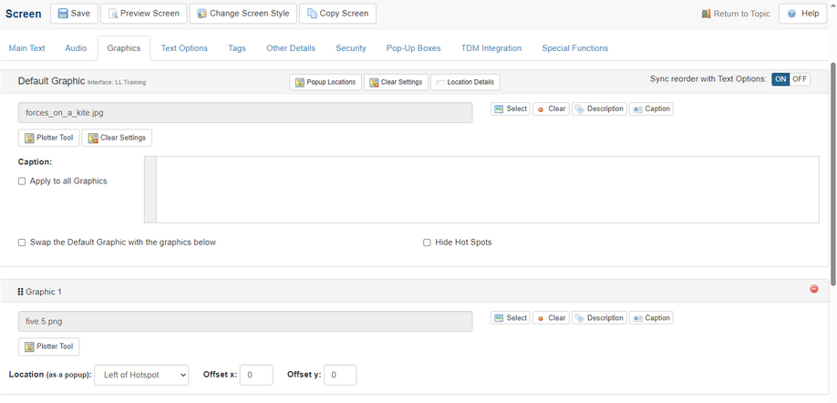
| 2. | Click the checkbox labeled Swap the Default Graphic with the graphics below to toggle between showing graphics in pop-ups or using them to replace the Default Graphic in the right pane. Click the checkbox labeled Hide Hot Spots to hide hotspots. The Caption field of the Default Graphic appears underneath it, and the Captions for the other graphics will appear below them in the pop-up windows. If you wish to have the same caption for all the images on this screen, click the Apply to all Graphics checkbox in the Default Graphic Caption field. Note: Hyperlinks and inline images may also be entered in the Caption field using the HTML editor. |
| 3. | Click the Plotter Tool button to open the Plotter Tool in a new window. The Plotter Tool button displays for every graphic added. Note: On the default graphic, one or more hotspot can be plotted for each Text Option. Note: See The Plotter Tool for more information on this feature. |
| 4. | Select a value for the Location drop-down for each graphic to choose where the pop-up appears on the screen, relative to the hotspot that triggers it (Bottom, Top, Left, Right), enter values for Offset X and Offset Y to control the exact positioning. Note: These settings are not relevant if the Swap the Default Graphic box is checked. Clicking the Clear Settings button will remove the settings on the desired graphic. Clicking the Clear Settings button near the top of the screen will clear the settings for all the graphics. |
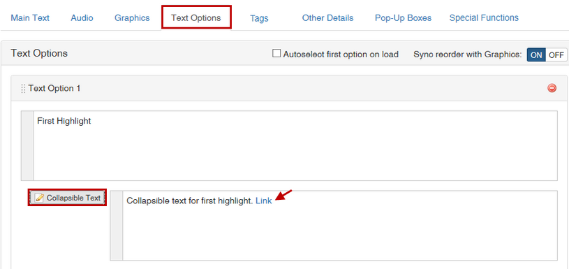
| 5. | The Text Options tab is used to define the text displayed as interactive Text Options on the left. These fields correspond with the Graphics fields of the same number (i.e., Text Option 1 corresponds with Graphic 1). Click the Add Text Option button to add more Text Options, up to a maximum of nine. HTML tags can be inserted into the Text Options field, to format text. To reorder Text Options fields, use the drag-handles on the top-left of the Text Option field. To reorder the associated media at the same time as the Text Options, be sure the Sync reorder with Graphics toggle is ON. To remove a text option, click the Remove Text Option Icon. Note: Deleting a Text Option does not delete its corresponding graphic. Graphics must be deleted separately. |
| 6. | Click the Collapsible Text button under each Text Option to display an HTML editor field. Here you can add optional hidden text, to be displayed when the corresponding Text Option is clicked in the viewer. You may also add links in Collapsible Text to the hotspot coordinates on the image. See Hyperlink to Image Highlight (Hotspot) for more information. |
| 7. | On preview, Main Text appears on the left and the Default Graphic on the right. Click Text Options or corresponding highlighted hotspots on the media asset to reveal an additional graphic (in a pop-up window or replacing the main media asset). The corresponding Graphic file is displayed in a pop-up window unless Swap the Default Graphic with the graphics below is checked, in which case the image in the right pane will change. Click the checkbox labeled Autoselect first option on load to display Text Option 1 with its corresponding Coordinate when the screen loads. |
Interactive Control Panel
To use this screen to simulate an interactive control panel, you will normally want to have multiple versions of the same graphic, each showing a control panel with identical buttons but different output on a display or gauges. By drawing hotspots over the buttons, you can make them clickable. Note: It's important that the buttons are in the same location in each graphic because the hotspots will always be in the same position. When the user clicks a specific button the graphic can be swapped to show the same control panel in a different state, e.g. with relevant output shown on its display.
|